Typography is one of the most integral parts of the design process. It can invoke a new feeling, inspire an idea nonverbally, or give context to a movement. It’s the foundation to any project that has an idea to convey. Type can make or break an experience, and directly influence the customer’s perception of your brand. But where does it all come from, and why is it so important?
Typography: The Beginning
Written works and manuscripts were popularized in the middle ages thanks to Joannes Gutenberg and the invention of the printing press. Handwritten works became a thing of the past, and suddenly information could be mass produced quickly and precisely.
Due to the influx of typed works, there was an increased need for dependable legibility when it came to the information being reproduced. Cue the birth of typography as a way to drive communication graphically. This would eventually give way to the art form we know and use today.
Typography changed the way we communicate with those around us and gave us the ability to understand information in a new and visually attractive way.
Typography: Yesterday + Today
Contemporary society has adopted typography as both an art form and a way to disperse information in a variety of media: books, the internet, your local car dealership’s commercials, you name it. They all utilize a form of typography in their produced media. Type is a great way to create an atmosphere for your brand because it gives a viewer something to base their sense of the work that you do on.
One of the best examples of how type can shift the intention and interpretation of a culture dates back to the 20th century. During WWII, typography became a huge part of public inspiration, both at home and abroad. Germany wanted to inspire nationalist sentiment amongst its citizens, using traditional gothic typography that had a history in the original type foundries of the country. They wanted to showcase the strength and heritage their country had been built upon by reinforcing the aesthetics already synonymous with their culture.
To combat this style and set themselves apart from the fascist regime, America developed a typeface called Futura, which stood in stark contrast to the rigid, traditional styles Germany was using. Motivated by the ideas of freedom, modernity, and independent expression, Futura became a symbol of America’s legacy.
Today, Futura is still used by companies such as Nike. The typeface is an integral part of their brand and tagline, “Just Do It.” It has even inspired spin-off typefaces, paying homage to the history it brings to the table but reclaiming that idea of independent expression. Currently, the US Men’s Soccer Team uses the spin-off of Futura, Futwora, as the typeface of choice for their brand collateral.
While typography and its meaning has grown and changed over the past few centuries, so has its production. Type foundries, built on designing fonts for printed works, now have become a mecca for type design for any media- both printed and digital. There are 67 recognized type foundries in the US.
Type design is a combination of understanding visual legibility and style, the intersection of the two producing, you guessed it, a new typeface. A single typeface can take years to finalize before becoming a user-facing option on your home computer. The nuances of each letter can be a difficult and tedious process. Each typeface you see is a labor of perfection, and oftentimes a type designer’s life work!
Type: Style Categories and Meaning
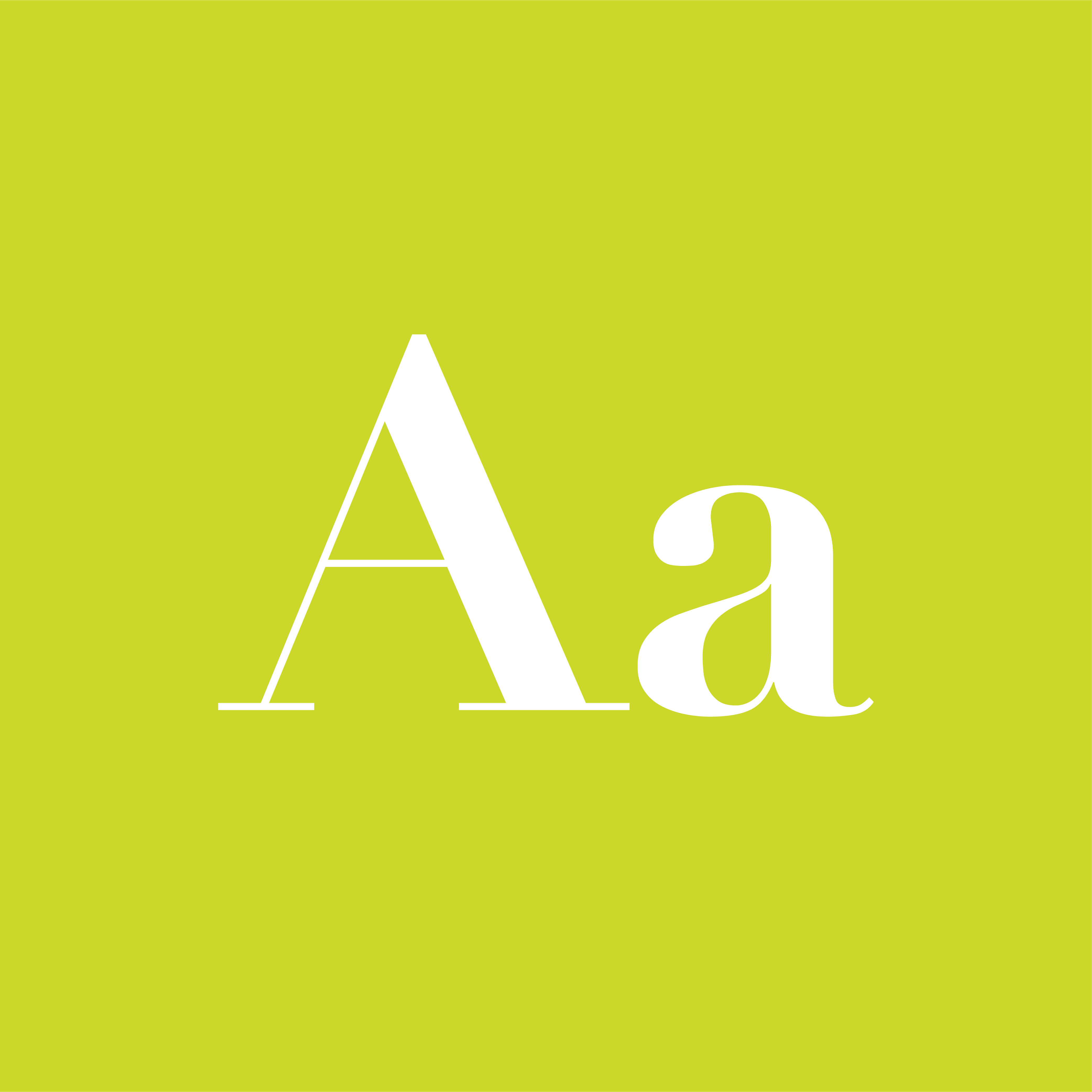
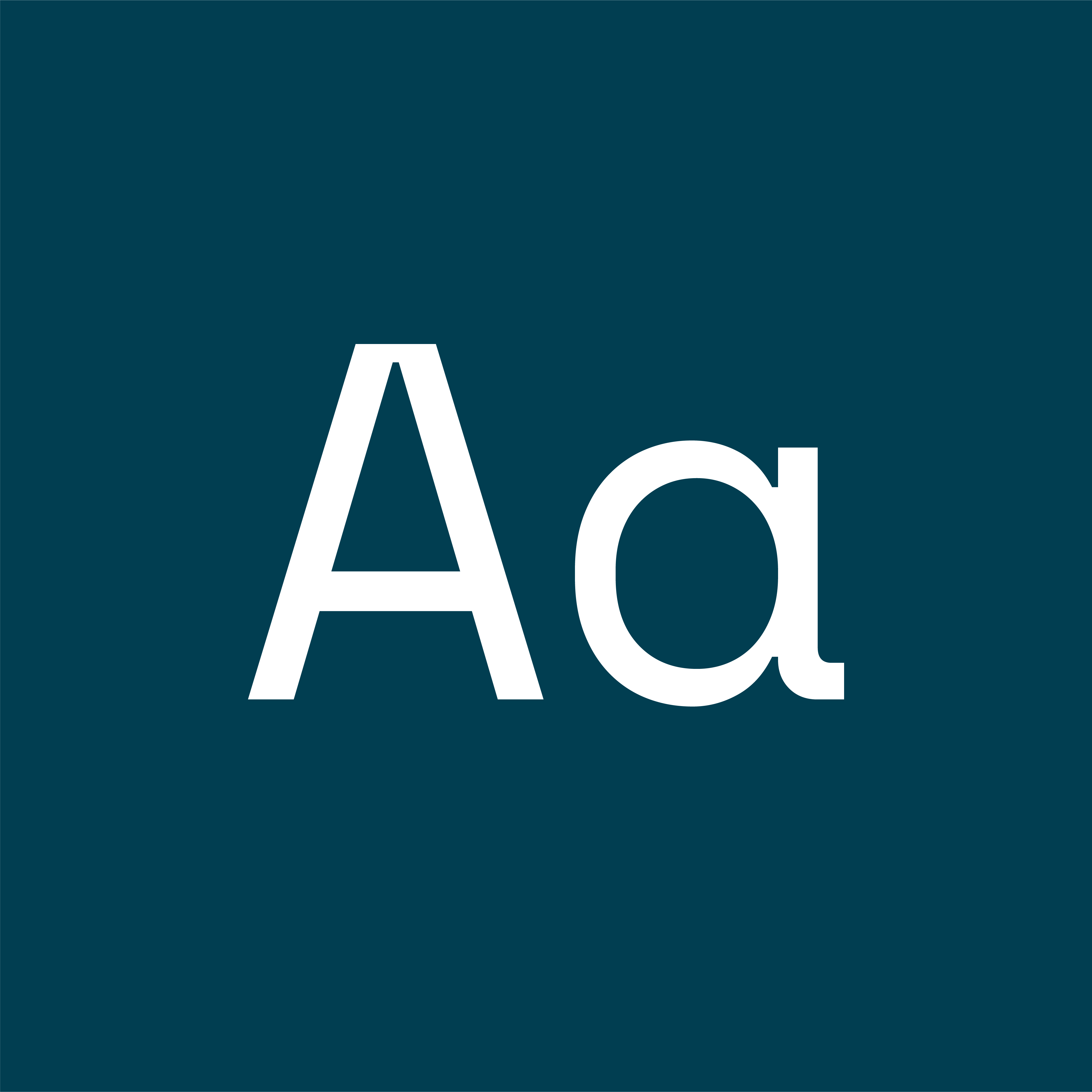
The main categories of type styles consist of serif, sans serif, monospace, and decorative.

SERIF
A serif is a small line or stroke attached to the end of a larger stroke in a letter or symbol within a particular typeface. Serif fonts can be considered traditional or rigid (think, “Times New Roman”)

SANS SERIF
Sans-serif is a typographic style where the letters do not have extending features called “serifs” at the end of strokes. Sans-Serif fonts can be interpreted as less formal and more modern than other styles.

DECORATIVE
Also known as script fonts, Decorative typefaces have extreme features such as swashes or exaggerated serifs. Often, a decorative typeface is personalized to the brand’s aesthetic features.

MONOSPACE
A monospaced font’s letters and characters each occupy the same amount of horizontal space. Can be synonymous with futuristic or “sci-fi” styled messaging.
Typography: Context for your brand
When defining the impression you hope to exhibit with your brand, it presents an opportunity to develop an impactful relationship with the styles of type chosen to your foundation.
A bigger, fast-paced brand might want to consider choosing a bold, more impactful serif typeface, whereas a quieter, smaller scale brand might want to look into a typeface that’s nuanced and personalized, possibly a decorative style.
Being able to distinguish and choose the type that’s right for your brand is imperative in the creation of an image that represents your work’s values.
Does your typography speak to your project?
For help with your typography pairings, decisions, and more, look to Holland Adhaus for assistance with any type needs. Contact us today for more information!

Justin Ellison
Graphic & Web Designer, Holland Adhaus
Justin’s work always stands out from the rest.


